Showing posts with label typography. Show all posts

Sunday, July 17, 2022

The Laced Back Stitch: an ideal stitch for lettering

I recently studied laced stitches in a workshop with Susan Brandeis: the laced running stitch, laced chain stitch, and (my new favorite hand embroidery stitch) the laced backstitch. 

Circle Sampler: laced running stitch circle surrounded with French knots.


Stitched Typography

The laced back stitch came in very handy for documenting a day range on each of the stitched scrolls from my 100 Days of Slow Stitching with Found Objects project.

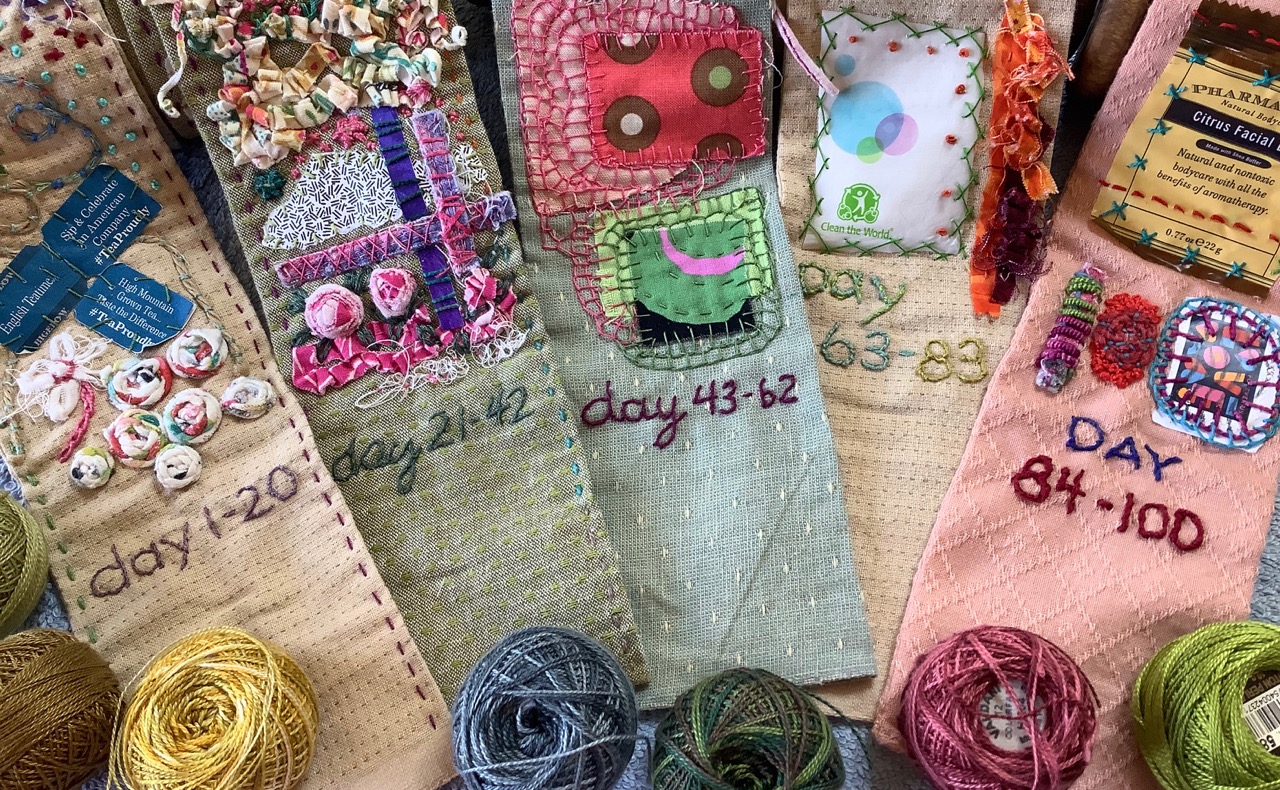
Documenting the day range on each scroll with the laced back stitch.

The letters and numbers were stitched on each scroll using the back stitch. Then, a second thread was woven or laced through those stitches. The laced thread lays on the surface of the work and is kept in place by the initial back stitches.  

My "stitched typography" was perfected by this lacing (weaving) technique. The photo below shows “before” and “after” lacing. See how the letters are smoother, more cohesive, and more readable? They are also slightly bolder because of the additional thread. The letters now appear more "finished."

Back stitch (top) and laced back stitch (below).

Even as an afterthought, if you decide you want a laced stitch, you can easily go back and do it on existing work.

Vintage Stitch Dictionaries

Two of my vintage stitch dictionaries provide variations on laced stitches. These stitches are also referred to as "threaded" stitches and "whipped" stitches. Whatever the terminology, they are fun and easy stitches to accomplish.

From Needlework Stitches by Barbara Snook.

From Handbook of Stitches by Grete Petersen and Elsie Svennås.


Laced stitch variations

The lacing technique has all kinds of exciting options! Experiment with lacing a contrasting color of thread, multiple threads, decorative yarns, silk ribbon, fabric slivers, weaving in different directions, or incorporate other embellishments.

A running stitch laced with a stand of sock yarn. 
The tension of the laced yarn varies to provide dimension and interest.

Try them all!


Thursday, March 31, 2016

ATCs: Calligraphy

"Create" by Dawn Spagna
Calligraphy.

Beautiful writing.

From the Greek:
kallos = "beauty" and graphein = "to write."

As a typographer, I love letterforms and was excited to propose Calligraphy as the March theme for my FiberAntics Artist Trading Card (ATC) swap. Calligraphy elevates letterforms and the written word to more than the carrier of a message... to something of visual beauty.

I often hear my friends that are teachers (or former teachers) say that penmanship and cursive writing are no longer taught in schools. This makes me sad. I can only hope that children find interest in the beauty of letterforms through classes and books about art and design, typography, graphic arts, printing, publishing, book arts or through collections and exhibits in libraries and museums.

When moveable type was first invented, the type was cut to mimic hand lettering. There was more than one version of an individual letter—say, for instance, 3 variations of the lower case "a" and 5 variations of the lower case "e." This was so the printed text looked like it was penned by a person—not a machine—with the inherent variations that come with hand lettering. Like our Artist Trading Cards, there is an intrinsic beauty, a uniqueness, and a personal quality to letters and texts that are created by hand.
"Calligraphy" by Karen Downer
"It is Writ" by Cathy Dillon
"Freeform Calligraphy with inks" by Marilyn League
"Calligraphy. The more you practice, the better you get."
by Veronica Hofman-Ortega
"Calligraphy" by Debbie Joyner
"A Palindrome" by Diane Pineschi
"Calligraphy (One of my Favorites)" by Bonnie Stevens
When was the last time you penned any letters by hand?

Sunday, March 2, 2014

ATCs: The Fine Print (text only)

I am always fascinated by how people's minds work and how they interpret words, concepts, and situations. This month's Artist Trading Cards (ATCs) are a case in point.

"ATCs" (a typographic digital collage)
by Veronica Hofman-Ortega
To give a little background… throughout the year I gather theme ideas for future FiberAntics ATC swaps. It's just a running list. I make a notation when I find a potential idea. Random trolling, happenstance, and amusing or interesting situations that catch my attention all play a part in its compilation.

Toward the end of the year, I review and cull from this extensive list for the upcoming year's themes. Sometimes the words or phrases are either too abstract or too verbose, so an editing and refining process ensues.

For the ATC themes, I try to have a mix of identifiable or physical objects (birds, favorite authors, pasta, architectural elements, numbers, colors), situations (First Thing in the Morning, A walk in the Park, Things found on Restaurant Napkins), and open-ended interpretive concepts (What's in your Heart, Around the World, It's about Time, Just add Water). My intent is to make the swaps interesting and challenging for the participants as well as keep our brains active with a monthly session of mental aerobics.

When editing the ideas for the themes, my career, life experiences, and surroundings, no doubt, enter into the process—whether consciously or subconsciously. Herein lies this month's theme: "The Fine Print (text only)." I am a typographer, printer and graphic communicator by trade. Thus said, I thought it would be interesting to have a theme that was "typographic"… using letterforms... text only. So, rather than post "Typography Only," the theme morphed into "The Fine Print."

So, hit me upside the head—that's what this month's ATC artists submitted in response to the theme, "The Fine Print (text only)"—a lot of very fine (read: small) print! The ATCs are clever, funny, and all handsomely crafted, with uniquely individual expressions. (See what I mean by different interpretations of the same phrase?) So get out your reading glasses or magnifying glass and enjoy the "fine print" in this collection:

The first card details the "expenses" for the FREE Kitty, ending with "Unconditional love for the owner—priceless." (The last far outweighs the others, I would say.)
"Free Kitty Free Kitty Free Kitty"
Unconditional love for the owner—Priceless
by Karen Downer
This Valentine ATC expresses "All you need is LOVE" and "LOVE makes the world go round." The woven (shredded) strips in the background are a nice complement to the hearts.
"The Fine Print: Shred it and make Valentines!"
by Linda Smith
This next card is related to the snow-filled season we have all had this year. Let Spring begin, already!
"The Snow Plow Contract"
by Bonnie Stevens
The small print in the background of this next card appear to be addresses from the phone book. Would you like to live on ATC Drive, or ATC Lane?
"The Fine Print" by Sharon Griffith
The stark, black-and-white fine print with the bold, red, all-caps 7-letter word stamped across the page portrays a serious and somber situation.
"The Fine Print" by M. League
Somehow, I wonder if the back of this ATC illustrates a different mood??
(back of ATC)
Thank you to all the ATC artists who participate in my monthly ATC swaps! You continually open my eyes and mind to new ideas and interpretations. Not to mention, great art!
Related Posts Plugin for WordPress, Blogger...